
ローディングアニメーション 水がいっぱいになるやつ ※ロゴURLは当HPのドメインで使うこと!
/* ==============================
ローディング
水アニメロゴ+中央から外へ四角く開く
mask固定版
============================== */
ロゴ表示後に開いていく時間などは上記追加cssで調整。
ロゴURLはJS【ロゴアニメーション 水注ぎロゴ 3文字白抜き】にいれる。
ローディングの水をいっぱいにする時間や待機時間など調整可能。
幕色とロゴ文字色は同じになるように設定している。
新・固定表示の開閉タブ
下記cssとJS【新・固定表示開閉タブOP/CL タブ遅延仕様 / 表示が崩れない対策】でうごく。
/* ===========================
NEW 固定表示開閉タブ
完全作り直し版
動き:
・文章の幅は最初から完成幅
・外側だけ0幅にして隠す
・中身は左からスライド
・高さ計算JSなし
============================= */

無料のHPフィッティング(デモサイト作成)
❖ 画像や文章は、事業内容に合わせて変更可能
❖ 他のデザインも見たい方はこちら
固定背景bg1を左から右へ動かしたり、じんわり拡大するcssはカスタムに入っている。片方は効かなくしている。
none

固定背景を非表示にするには、stock-blockをクラス名にいれる。それとbg5 or bg6のクラス名を変更する → bg6stockとか。
スライド、アンカー確認!
none
【スライドや固定背景の増減についての基本設定・要点】
【基本型4枚 2枚まで増加可能】
通常:
b1 → b2 → b3 → b6 → b7
bg1 → bg2 → bg3 → bg4
1枚追加:
b1 → b2 → b3 → b4 → b6 → b7
bg1 → bg2 → bg3 → bg5 → bg4
2枚追加:
b1 → b2 → b3 → b4 → b5 → b6 → b7 b7は最後のCONTACT用。b6の直後に置く。最後位置の計算に使う。
bg1 → bg2 → bg3 → bg5 → bg6 → bg4 いずれもbg4をラストにする。
b4 / b5:追加用の普通スライド。b3 と b6 の間に入れる。b2・b6と同じ固定幅タイプ。
スマホのb1上での配置などを調整する場合
スマホのときのb1上の文字の配置はYOKOHPのcss上で決めている。
/* ======================================
スマホ:b1を透明 + 文字を画面中央表示
+ 位置微調整できる版
====================================== */
body:not(.wp-admin):not(.block-editor-iframe__body){
--b1-text-x: 0px; /* b1全体の文字:左右位置 */
--b1-text-y: -150px; /* b1全体の文字:上下位置 */ ←タイトルのこと
--b1-swipe-x: 0px; /* b1内のsp-only:左右位置 */ ←swipのやつのこと
--b1-swipe-y: 300px; /* b1内のsp-only:上下位置 */
光差し込み+透明からレイヤーor画像へのアニメーション
selector{
position: relative !important;
overflow: hidden !important;
isolation: isolate !important;
}
/* 画像+色レイヤーをまとめて透明から表示 */
selector .wp-block-cover__image-background,
selector .wp-block-cover__background{
animation: coverLayerFadeIn 5.0s ease-out 2.0s both;
animation-play-state: paused;
}
/* このカバー自身がアクティブになったら開始 */
selector.b-anim-active .wp-block-cover__image-background,
selector.b-anim-active .wp-block-cover__background{
animation-play-state: running;
}
/* 光:最初は透明からじんわり表示 */
selector::before{
content: "" !important;
position: absolute !important;
inset: -45% -35% !important;
z-index: 2 !important;
pointer-events: none !important;
background:
linear-gradient(116deg,
transparent 0%,
transparent 16%,
rgba(255,255,255,0.06) 20%,
rgba(255,255,255,0.34) 25%,
rgba(255,255,255,0.12) 31%,
transparent 39%
),
linear-gradient(113deg,
transparent 0%,
transparent 41%,
rgba(255,255,255,0.05) 44%,
rgba(255,255,255,0.24) 45.5%,
rgba(255,255,255,0.05) 47%,
transparent 52%
),
linear-gradient(119deg,
transparent 0%,
transparent 59%,
rgba(255,255,255,0.04) 63%,
rgba(255,255,255,0.26) 68%,
rgba(255,255,255,0.07) 73%,
transparent 81%
),
linear-gradient(111deg,
transparent 0%,
transparent 74%,
rgba(255,255,255,0.04) 75%,
rgba(255,255,255,0.18) 76%,
rgba(255,255,255,0.04) 77%,
transparent 81%
) !important;
filter: blur(10px) !important;
mix-blend-mode: screen !important;
animation: lightMainFadeIn 5.0s ease-out 2.2s both !important;
animation-play-state: paused !important;
}
/* 補助光 */
selector::after{
content: "" !important;
position: absolute !important;
inset: -50% -30% !important;
z-index: 2 !important;
pointer-events: none !important;
background:
linear-gradient(117deg,
transparent 0%,
transparent 32%,
rgba(255,255,255,0.04) 35%,
rgba(255,255,255,0.15) 36.5%,
rgba(255,255,255,0.04) 38%,
transparent 44%
),
linear-gradient(108deg,
transparent 0%,
transparent 52%,
rgba(255,255,255,0.035) 57%,
rgba(255,255,255,0.17) 64%,
rgba(255,255,255,0.05) 70%,
transparent 79%
) !important;
filter: blur(18px) !important;
mix-blend-mode: screen !important;
animation: lightSubFadeIn 5.0s ease-out 2.4s both !important;
animation-play-state: paused !important;
}
/* このカバー自身がアクティブになったら光も開始 */
selector.b-anim-active::before,
selector.b-anim-active::after{
animation-play-state: running !important;
}
/* 文字は一番上 */
selector .wp-block-cover__inner-container{
position: relative !important;
z-index: 3 !important;
}
/* 編集画面では普通に表示 */
.editor-styles-wrapper selector .wp-block-cover__image-background,
.editor-styles-wrapper selector .wp-block-cover__background{
animation: none !important;
}
.editor-styles-wrapper selector::before,
.editor-styles-wrapper selector::after{
animation: none !important;
opacity: 1 !important;
}
/* 透明 → それぞれ元の透明度へ戻る */
@keyframes coverLayerFadeIn{
from{
opacity: 0;
}
}
/* 主光:透明 → 表示 */
@keyframes lightMainFadeIn{
from{
opacity: 0;
}
to{
opacity: 1;
}
}
/* 補助光:透明 → 表示 */
@keyframes lightSubFadeIn{
from{
opacity: 0;
}
to{
opacity: 0.9;
}
}
単にグラデを用いない透明からレイヤーor画像へのアニメーション
/* 画像+色レイヤーをまとめて透明から表示 */
selector .wp-block-cover__image-background,
selector .wp-block-cover__background{
animation: coverLayerFadeIn 5.0s ease-out 2.0s both;
animation-play-state: paused;
}
/* このカバー自身がアクティブになったら開始 */
selector.b-anim-active .wp-block-cover__image-background,
selector.b-anim-active .wp-block-cover__background{
animation-play-state: running;
}
/* 編集画面では普通に表示 */
.editor-styles-wrapper selector .wp-block-cover__image-background,
.editor-styles-wrapper selector .wp-block-cover__background{
animation: none !important;
}
/* 透明 → それぞれ元の透明度へ戻る */
@keyframes coverLayerFadeIn{
from{
opacity: 0;
}
}
グラデ+透明からレイヤーor画像へのアニメーション
selector{
/* ここだけ変更 */
--grad-left: #ffffff00; /* 左の色 */
--grad-right: #e9a02a; /* 右の色 */
--grad-opacity: 0.55; /* グラデの濃さ */
position: relative !important;
overflow: hidden !important;
}
/* カバー色レイヤーをグラデーションにする */
selector .wp-block-cover__background{
background: linear-gradient(
90deg,
var(--grad-left) 0%,
var(--grad-right) 100%
) !important;
opacity: var(--grad-opacity);
}
/* 画像+グラデーションをまとめて透明から表示 */
selector .wp-block-cover__image-background,
selector .wp-block-cover__background{
animation: coverLayerFadeIn 5.0s ease-out 2.0s both;
animation-play-state: paused;
}
/* このカバー自身がアクティブになったら開始 */
selector.b-anim-active .wp-block-cover__image-background,
selector.b-anim-active .wp-block-cover__background{
animation-play-state: running;
}
/* 編集画面では普通に表示 */
.editor-styles-wrapper selector .wp-block-cover__image-background,
.editor-styles-wrapper selector .wp-block-cover__background{
animation: none !important;
}
/* 文字は一番上 */
selector .wp-block-cover__inner-container{
position: relative !important;
z-index: 3 !important;
}
/* 透明 → それぞれ元の透明度へ戻る */
@keyframes coverLayerFadeIn{
from{
opacity: 0;
}
}
イタリア創作料理
Gondola
ベネチア郷土料理を日本風にアレンジしています
We offer Venetian local cuisine with a Japanese twist.
Swipe →
b2,b4はシート増加可能
※※b2-free,b4-freeの中にいれるのはカバー(共通、pc-only、sp-only)じゃないと体裁がおかしくなるから注意!
※※b2-free,b4-freeと中のカバーは必須だから、b5とかにつかっているものから引っ張ってくるときは体裁を変える必要がある場合がある
カバー(b-half b2)
└グループ(b2-free)
└カバー(pc-only)
└カバー(sp-only)
└カバー(共通)
b2,b4のシートは増加して、くっつけることができる(b2-free,b4-freeを追加した)。一応シート幅はマックス75vwだが、それ以下なら下記cssをカスタムcssにいれて調整できる。ただこのcssはスマホに効かせるとスマホ幅の75vwになるからPCのみに効かせること。
body:not(.wp-admin):not(.block-editor-iframe__body) selector{
width: 75vw !important;
min-width: 75vw !important;
max-width: none !important;
flex: 0 0 75vw !important;
}
※※b2-free,b4-freeの中にいれるのはカバーじゃないと体裁がおかしくなるから注意!
けっこうpc-onlyをグループにつけてるやつもあるのでそれはカバーに変更しなければきちんと反映されない。
ランチ Lunch Course
Aコース
¥4,000
・旬の前菜の盛り合わせ
・本日のパスタ(下記3種類から選べます)
a.イカ墨と九条ねぎのパスタ
b.あさりと柚子胡椒のボンゴレ
c.季節のGONDORAパスタ
・本日のメインディッシュ(下記2種類から選べます)
a.白身魚の南蛮サオール仕立て
b.鴨肉の赤ワイン味噌ソース
・GONDORAデザート
・ドリンク(エスプレッソorTEA)
Bコース
¥6,000
・旬の前菜の盛り合わせ
・本日のパスタ(下記3種類から選べます)
a.イカ墨と九条ねぎのパスタ
b.あさりと柚子胡椒のボンゴレ
c.季節のGONDORAパスタ
・鮮魚料理(白身魚の南蛮サオール仕立て)
・肉料理(鴨肉の赤ワイン味噌ソース)
・GONDORAデザート
・ドリンク(エスプレッソorTEA)
スマホ出力後の体裁
下記追加cssにて調整可能
/* ==============================
PRICE スマホ自動出力
PC側 price-section を読み込み
============================== */
JSは「美容室版料金表のPC項目読み込み(スマホ用)」
文字フォントを一気にかえる場合は、下記をスマホ出力グループのカスタムcssにいれる
@media screen and (max-width: 600px){
.price-output,
.price-output *{
font-family: "Zen Kaku Gothic New", sans-serif !important;
}
}
LUNCH MENU
b3の中での各カバーの横幅設定について(重要!)
基本的な設定として、b3のスライドは中身に応じて自動収縮する。ただ、カラムとかを利用する場合、普通の文字を利用する場合と違いが生じる。細かいところは省くが、文字だけならあまり問題ないが、カラムを利用する場合は特に、親のカバーには下記カスタムcssをいれて、幅を指定することを推奨する。ただ、これはあくまでpc-onlyの場合のことでスマホと共通利用の場合はメディアクエリを使用すること。
下記cssの75vwを基本的には上限として内容によって変えていくのが良い。
body:not(.wp-admin):not(.block-editor-iframe__body) selector{
width: 75vw !important;
min-width: 75vw !important;
max-width: none !important;
flex: 0 0 75vw !important;
}
/* 編集画面では幅指定を解除 */
.editor-styles-wrapper selector,
.block-editor-iframe__body selector{
width: auto !important;
min-width: 0 !important;
max-width: none !important;
flex: initial !important;
}
b3スライドの位置変更について(重要!)
b3の位置によってJSをかえていく。共存不可!!編集ページ内での位置はいまのままb2→b3→b4でいい。
b1→b2→b3→b4 JS(【横スクロールHP本体】<b2→b3 ノーマルver>目次page内link / スマホ対応 / スナップ付 /)
b1→b3→b2→b4 JS(【横スクロールHP本体】<b3→b2 ver>目次page内link / スマホ対応 / スナップ付 /)
b1→b2→b4→b3 JS(【横スクロールHP本体】<b4→b3 ver>目次page内link / スマホ対応 / スナップ付 /)
写真ギャラリー型にするひな形。読込元のこのカバーはstock-blockで非表示にしている。そのかわりPC版とスマホ版の出力グループを【並列で】出している。
■ b3-freeのグループにsg-tightを追加すれば、画像同士をくっつけることができる!
/* ==============================
SERVICE GALLERY
sg-tight を付けた時だけ
画像を縦横くっつける
============================== */
■ 追加css
/* ==============================
SERVICE GALLERY
sg-source → sg-pc / sg-sp 自動出力
PC・SPともに2枚縦積み
横幅は中身の枚数ぶん増える
横スクロール本体JSは触らない
============================== */
■ JSも利用している。「b3に画像ギャラリーを追加するためのJS」
b3を作成するときは必ず横幅を100vw以上にすること!シート1枚じゃ足りない【重要!】
シート1枚分の75vwとかだとなぜかb3スライド左の余白が100vwとの差の25vw広がって、b3右の余白が25vw短くなる。どうしようもなおせない。
一枚目のタイトル用のカバーを透過させるにはその裏のカバー(b-half-b3)を透過させておくこと
none
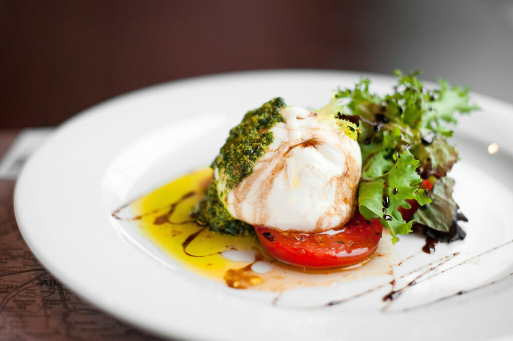
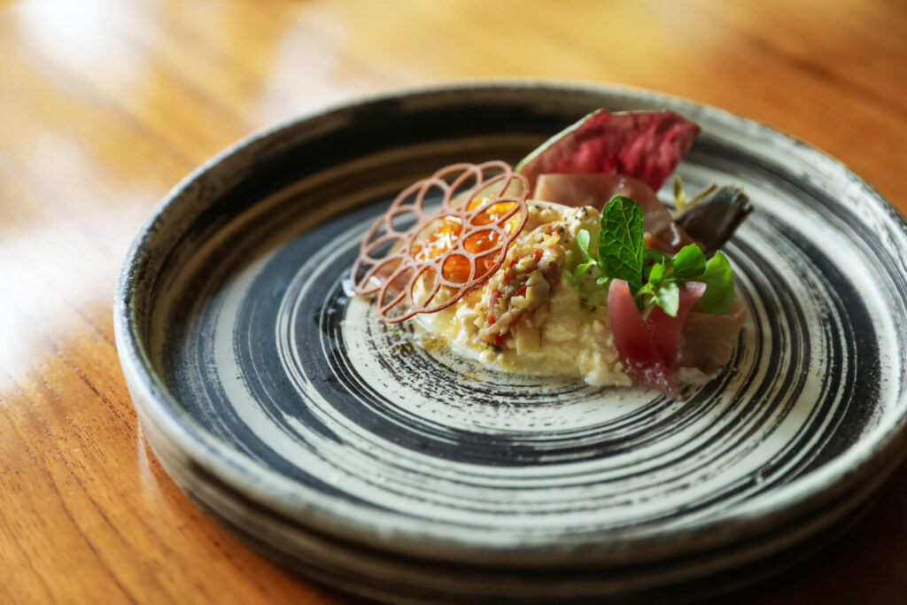
創作料理
- Italian -
すたいる1
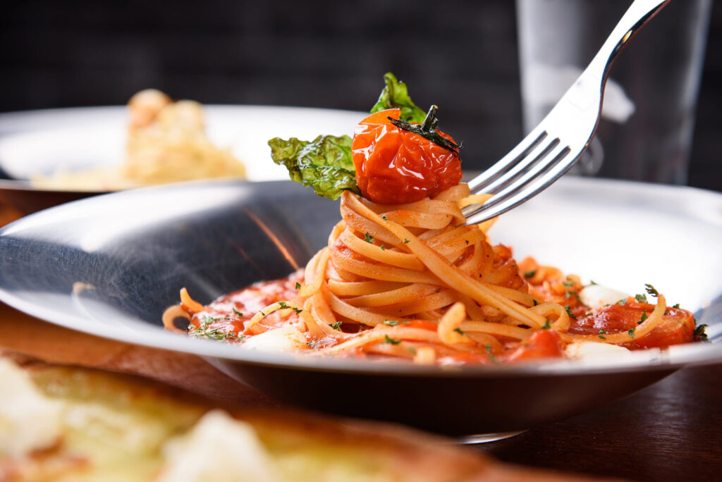
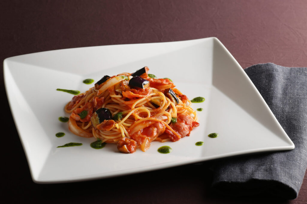
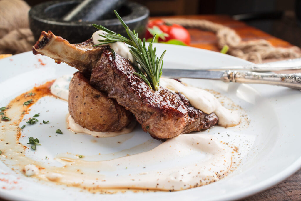
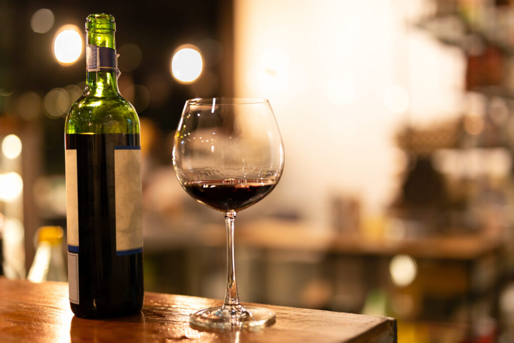
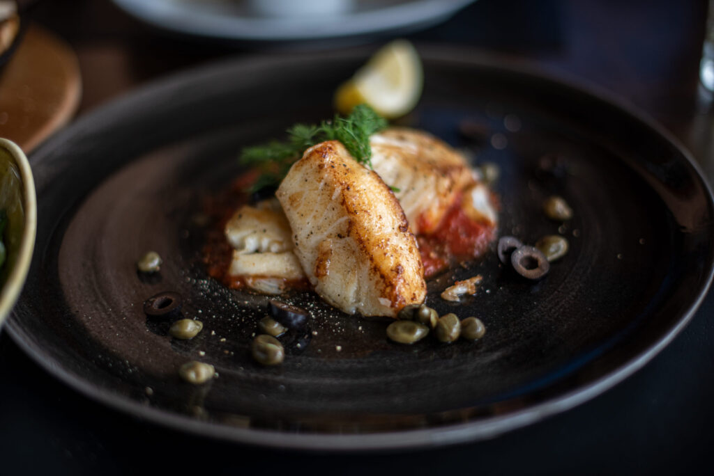
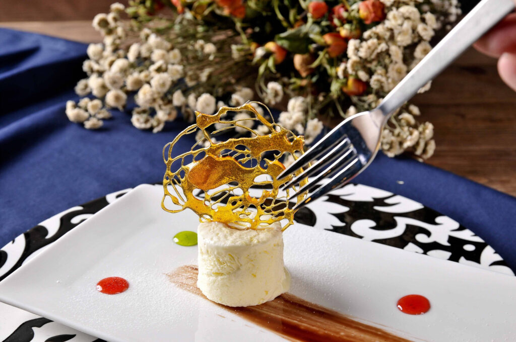
↓PC出力用グループ
体裁調整 追加css
/* ==============================
SERVICE GALLERY
sg-source → sg-pc / sg-sp 自動出力
PC・SPともに2枚縦積み
横幅は中身の枚数ぶん増える
横スクロール本体JSは触らない
============================== */
↓SP出力用グループ
体裁調整 追加css
/* ==============================
SERVICE GALLERY
sg-source → sg-pc / sg-sp 自動出力
PC・SPともに2枚縦積み
横幅は中身の枚数ぶん増える
横スクロール本体JSは触らない
============================== */
PRICE / MENU
CUT
一般
¥5,000
高校生以下
¥3,000
小学生以下
¥2,000
COLOR
ワンメイク
¥6,000
ブリーチ
¥6,000
ナチュラルハーブカラー
¥7,000
オーガニックカラー
¥6,500
PERM
ポイントパーマ
¥3,000
デザインパーマ
¥6,000
デジタルパーマ
¥7,000
ストレートパーマ
¥7,000
縮毛矯正
¥8,000
OTHER
セット
¥5,000
メイク
¥3,000
着付け
¥7,000
スマホ出力後の体裁
下記追加cssにて調整可能
/* ==============================
PRICE スマホ自動出力
PC側 price-section を読み込み
============================== */
JSは「美容室版料金表のPC項目読み込み(スマホ用)」
文字フォントを一気にかえる場合は、下記をスマホ出力グループのカスタムcssにいれる
@media screen and (max-width: 600px){
.price-output,
.price-output *{
font-family: "Zen Kaku Gothic New", sans-serif !important;
}
}
PRICE / MENU
左縦型タイトルの体裁が崩れないようにするカラム設定について
selector{
display: grid !important;
grid-template-columns: 63px 29px 10fr 45fr 45fr !important;
align-items: stretch !important;
}
カスタムcssで決めている。
1列目63px、2列目29px、3列目-5列目を100%として割り振っている。
増減も可能。その場合は3列目以降を都度調整すること
取り扱いみかん
contents
🍊 温州みかん1
3kg/3,000円~
甘さと酸味のバランスが良く、贈答用として一番人気がある品種
🍊 温州みかん2
3kg/3,000円~
甘さと酸味のバランスが良く、贈答用として一番人気がある品種甘さと酸味のバランスが良く、贈答用として一番人気がある品種甘さと酸味のバランスが良く、贈答用として一番人気がある品種
🍊 温州みかん 3
3kg/3,000円~
甘さと酸味のバランスが良く、贈答用として一番人気がある品種
🍊 温州みかん 4
3kg/3,000円~
甘さと酸味のバランスが良く、贈答用として一番人気がある品種甘さと酸味のバランスが良く、贈答用として一番人気がある品種
🍊 温州みかん5
3kg/3,000円~
甘さと酸味のバランスが良く、贈答用として一番人気がある品種
🍊 温州みかん 6
3kg/3,000円~
甘さと酸味のバランスが良く、贈答用として一番人気がある品種
🍊 温州みかん 7
3kg/3,000円~
甘さと酸味のバランスが良く、贈答用として一番人気がある品種甘さと酸味のバランスが良く、贈答用として一番人気がある品種
🍊 温州みかん 8
3kg/3,000円~
甘さと酸味のバランスが良く、贈答用として一番人気がある品種
PRICE
PRICE
取り扱いみかん🍊
【タイトル+説明文ver】 ※JSを【①タイトル+説明文】ギャラリー別ver(サービス)のPC項目をスマホに読み込ませる、にすること!
②との併用不可!片方は必ずオフにすること! クラス名が①も②も共通だからきちんとstock-blockで消すこと
下記追加cssにて調整可能 ①②とも共通
/* ==============================
スマホ用 SERVICE 自動切替表示
※ タイトルは編集ページ側で作る版
============================== */
JSは「【①タイトル+説明文】ギャラリー別ver(サービス)のPC項目をスマホに読み込ませる/自動切換/タイトル装飾引継ぎ」
左縦型タイトルの体裁が崩れないようにするカラム設定について
selector{
display: grid !important;
grid-template-columns: 63px 29px 100fr !important;
align-items: stretch !important;
}
カスタムcssで決めている。
1列目63px、2列目29px、3列目を100%として割り振っている。
増減も可能。その場合は3列目以降を都度調整すること
カウンセリングコース
contents
対面相談1
ーーーーーーーー説明文1ーーーーーーーーーーーーーーーーーーーーーーーーー
60分 8,000円(税込)

対面相談2
ーーーーーーーー説明文2ーーーーーーーーーーーーーーーーーーーーーーーーー
60分 8,000円(税込)
対面相談3
ーーーーーーーー説明文3ーーーーーーーーーーーーーーーーーーーーーーーーー
60分 8,000円(税込)
対面相談4
ーーーーーーーー説明文4ーーーーーーーーーーーーーーーーーーーーーーーーー
60分 8,000円(税込)
PRICE
PRICE
カウンセリングコース
【タイトル+説明文+画像 ver】 ※JSを【②タイトル+説明文+画像】ギャラリー別ver(サービス)のPC項目をスマホに読み込ませる、にすること! ①との併用不可!片方は必ずオフにすること! クラス名が①も②も共通だからきちんとstock-blockで消すこと
下記追加cssにて調整可能
/* ==============================
スマホ用 SERVICE 自動切替表示
※ タイトルは編集ページ側で作る版
============================== */
JSは「【タイトル+説明文+画像】ギャラリー別ver(サービス)のPC項目をスマホに読み込ませる/自動切換/タイトル装飾引継ぎ」
左縦型タイトルの体裁が崩れないようにするカラム設定について
selector{
display: grid !important;
grid-template-columns: 63px 29px 100fr !important;
align-items: stretch !important;
}
カスタムcssで決めている。
1列目63px、2列目29px、3列目を100%として割り振っている。
増減も可能。その場合は3列目以降を都度調整すること
カバーのカスタムcssで幅を少し短くしている。
基本は75vw
body:not(.wp-admin):not(.block-editor-iframe__body) selector{
width: 55vw !important;
min-width: 55vw !important;
max-width: none !important;
flex: 0 0 55vw !important;
}
予約の流れ
contents
1. お電話又はメールフォームでご連絡
2. 日時のご相談・確定
・日時の調整
・支払い方法のご案内
3. カウンセリングの実施
※オンライン・電話相談は事前決済、対面相談は当日のお支払いとなります。
・ご予約のキャンセルは前日までにご連絡をお願いいたします。
・当日キャンセルは、カウンセリング料金の100%を頂戴いたします。
・ご予約時間に遅れた場合、相談時間が短くなる場合がございます。
・お支払い後の返金は原則お受けしておりません。
RESERVATION
1. お電話又はメールフォームでご連絡
2. 日時のご相談・確定
・日時の調整
・支払い方法のご案内
3. カウンセリングの実施
※オンライン・電話相談は事前決済、対面相談は当日のお支払いとなります。
・ご予約のキャンセルは前日までにご連絡をお願いいたします。
・当日キャンセルは、カウンセリング料金の100%を頂戴いたします。
・ご予約時間に遅れた場合、相談時間が短くなる場合がございます。
・お支払い後の返金は原則お受けしておりません。
このカバーは全体を上寄せにしている。デフォルトは中央寄せだが2枚シートを連結させているため、文字数によってがたつきがでるから
カスタムcssにいれている
ディナー
Leggero
¥8,000
・ご挨拶の一品
A Welcome Appetizer
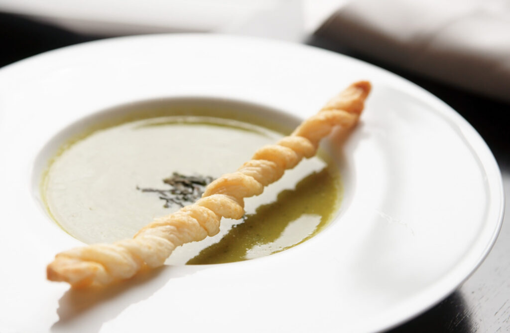
・季節野菜の冷製スープ
Seasonal Vegetable Chilled Soup
・GONDORA特製旬の前菜
GONDORA’s Special Seasonal Appetizer
・あさりと柚子胡椒のボンゴレ
Young Chicken and Yuzu Pepper Escabeche
・牛フィレ肉のグリル 赤ワインソース ベネチア風
Grilled Beef Fillet with Venetian-Style Red Wine Sauce
・本日のドルチェ
Today’s Dolce
Classico
¥10,000
・ご挨拶の一品
A Welcome Appetizer
・季節野菜の冷製スープ
Seasonal Vegetable Chilled Soup
・GONDORA特製旬の前菜
GONDORA’s Special Seasonal Appetizer
・本日の鮮魚料理
Today's Fresh Fish Dish
・あさりと柚子胡椒のボンゴレ
Young Chicken and Yuzu Pepper Escabeche
・牛フィレ肉のグリル 赤ワインソース ベネチア風
Grilled Beef Fillet with Venetian-Style Red Wine Sauce
・本日のドルチェ
Today’s Dolce
Dinner Course
Ricco
¥12,000
・ご挨拶の一品
A Welcome Appetizer
・季節野菜の冷製スープ
Seasonal Vegetable Chilled Soup
・GONDORA特製旬の前菜
GONDORA’s Special Seasonal Appetizer
・伊勢海老の一皿 クリームチーズソース
Ise Shrimp with Cream Cheese Sauce
・あさりと柚子胡椒のボンゴレ
Young Chicken and Yuzu Pepper Escabeche
・黒毛和牛のタリアータ バルサミコソース
Kuroge Wagyu Tagliata with Balsamic Sauce
・本日のドルチェ
Today’s Dolce
Lusso
¥15,000
・ご挨拶の一品
A Welcome Appetizer
・季節野菜の冷製スープ
Seasonal Vegetable Chilled Soup
・GONDORA特製旬の前菜
GONDORA’s Special Seasonal Appetizer
・伊勢海老の一皿 クリームチーズソース
Ise Shrimp with Cream Cheese Sauce
・フォアグラのポワレ キャビア添え
Foie Gras Poêlé with Caviar
・あさりと柚子胡椒のボンゴレ
Young Chicken and Yuzu Pepper Escabeche
・黒毛和牛のタリアータ バルサミコソース
Kuroge Wagyu Tagliata with Balsamic Sauce
・本日のドルチェ
Today’s Dolce
スマホ出力後の体裁
下記追加cssにて調整可能
/* ==============================
PRICE スマホ自動出力
PC側 price-section を読み込み
============================== */
JSは「美容室版料金表のPC項目読み込み(スマホ用)」
文字フォントを一気にかえる場合は、下記をスマホ出力グループのカスタムcssにいれる
@media screen and (max-width: 600px){
.price-output,
.price-output *{
font-family: "Zen Kaku Gothic New", sans-serif !important;
}
}
DINNER MENU
Shop/Order
作品は minne・Instagram にてご覧いただけます
販売中の作品は minne、新作のお知らせは Instagram へ
Online Shop
minneで販売中の作品を見る
新作・制作風景・POP UP 情報を見る
Order
色味やサイズのご相談も承ります
気になる作品は、Instagram DM または CONTACT へ

PC/スマホ兼用フォーム
none
PROFILE
夫婦関係カウンセラー
下崎 桜
説明文profile-scroll-textについて
JSで動いている。
【スマホ用のプロフィール蘭のスクロールバー(つまみ)の疑似化&自動表示・透過】
【PCの紹介文を一定高さ以上でスクロールできるようにするJS】
profile-scroll-textのテキスト欄に下記カスタムcssをいれている。
@media screen and (max-width: 768px){
.profile-scroll-text{
padding-right: 10px !important; /* 右 */
}
}
大学卒業後、結婚相談所で夫婦・家族に関する相談業務に携わる。
その後、心理カウンセリングを学び、夫婦関係や離婚前後の悩みに特化したカウンセラーとして活動を開始。
相談では、結論を急がせることよりも、まずその人自身が何に傷つき、何を守りたいのかを丁寧に見つめることを大切にしています。
趣味は読書とカフェめぐり。
休日は静かな場所で本を読んだり、季節の花を見に出かけたりしています。

STYLIST

Director
下峠 さりみ
経験8年

Stylist
龍神 円侍
経験14年
STYLIST
【slider式プロフィール】スマホ読込後のフォントや色、構成・文章量について(重要) 増減対応可能
上記説明文が高さ枠を超えるとスクロールバー(疑似含む)が出る仕組み。高さの枠は.gym-prof-sp-textのmax-height: 250px !important;で調整する。
/* ==============================
スマホPROFILE:PC項目読み込みスライダー 完成版
PC側:
gym-prof-source
gym-prof-img
gym-prof-role
gym-prof-name
gym-prof-text
SP側:
gym-prof-slider
============================== */
基本的には追加cssでフォントや色や、構成などは構築されている。個別で変えたいところがあれば下記名前のcssのところを変えると良い。ただし、各項目はスマホ読込されるとspという文字が追加されるから、調整するときはsp入りの名前を探すとよい。
なお、全体的にフォントを変えたいようなときには下記cssを下のカスタムcssにいれると全体がかわる。
@media screen and (max-width: 768px){
/* 全体のフォント */
.price-sp,
.price-sp *{
font-family: 'Libre Baskerville','Zen Kaku Gothic New', sans-serif !important;
}
}
PRICE 料金・コース
price-labelの体裁について
カスタムcssでlabel-form1とか2とか使ってる。これはprice-labelを使用してしまうとhide-frontで非表示にしても混同してしまうため。ラベル体裁用のフォームを使うこと
初めての方に
Trial Plan
体験プラン
¥5,000
1回60分
まずはお試し
気軽にどうぞ
初めての方に
Trial Plan
体験プラン
¥5,000
1回60分
まずはお試し
気軽にどうぞ
初めての方に
Trial Plan
体験プラン
¥5,000
1回60分
まずはお試し
気軽にどうぞ
初めての方に
Trial Plan
体験プラン
¥5,000
1回60分
まずはお試し
気軽にどうぞ
延長15分ごと2,000円
PRICE 料金・コース
下記料金表のスマホ読込後のフォントや色、構成について
/* ==============================
スマホ料金表:指定画像の形に寄せる
※ JSはそのまま
※ スマホだけ
============================== */
基本的には追加cssでフォントや色や、構成などは構築されている。個別で変えたいところがあれば下記名前のcssのところを変えると良い。ただし、price-enの項目はスマホ読込されるとprice-sp-enにかわるから、調整するときはspの名前を探すとよい。
なお、全体的にフォントを変えたいようなときには下記cssを下のカスタムcssにいれると全体がかわる。
@media screen and (max-width: 768px){
/* 全体のフォント */
.price-sp,
.price-sp *{
font-family: 'Libre Baskerville','Zen Kaku Gothic New', sans-serif !important;
}
}
もし4つなら下記案でやることも可能みたい
b3-free
├─ カバーA
│ ├─ pc-only
│ │ └─ PC料金表 4カード
│ └─ sp-only
│ └─ price-sp-page1
│
└─ カバーB
└─ sp-only
└─ price-sp-page2
price-type-a → カード型表示 price-type-aなし → 縦型表示 下記price-spグループに名前追加すること
/* ==============================
スマホ料金表:4枚入るコンパクト版
※ 変更しやすい変数版
※ ラベル幅は文字数に合わせる
※ price-label / price-price / price-note 表示
============================== */
↑デフォルト型css(縦型)
↓price-type-a型css(PCと同じカード型)
/* ==============================
price-type-a
PCカード風をスマホで2列表示:中間余白版
※ price-sp に price-type-a を付けた時だけ
※ 4枚→2列×2段
※ 3枚→2列+最後1枚中央
============================== */
@media screen and (max-width: 768px){
/* 全体のフォント */
.price-sp,
.price-sp *{
font-family: 'Libre Baskerville','Zen Kaku Gothic New', sans-serif !important;
}
}
PC/スマホ兼用フォーム
none
ABOUT
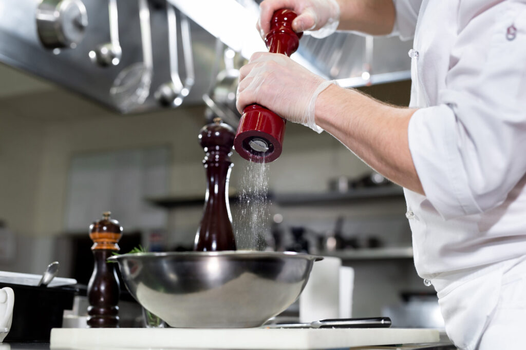
GONDORA
静岡県○○市○○-○-○
○○○-○○-○○○○
gondora@○○.com
OPEN 11:00-14:00 17:00-22:00
定休日 水曜日
CONTACT
予約・お問い合わせはこちら
LINEでのお問い合わせもOK

CONTACT
LINEでのお問い合わせOK
PC/スマホ兼用フォーム
none
PROFILE
夫婦関係カウンセラー
下崎 桜
説明文profile-scroll-textについて
JSで動いている。
【スマホ用のプロフィール蘭のスクロールバー(つまみ)の疑似化&自動表示・透過】
【PCの紹介文を一定高さ以上でスクロールできるようにするJS】
profile-scroll-textのテキスト欄に下記カスタムcssをいれている。
@media screen and (max-width: 768px){
.profile-scroll-text{
padding-right: 10px !important; /* 右 */
}
}
大学卒業後、結婚相談所で夫婦・家族に関する相談業務に携わる。
その後、心理カウンセリングを学び、夫婦関係や離婚前後の悩みに特化したカウンセラーとして活動を開始。
相談では、結論を急がせることよりも、まずその人自身が何に傷つき、何を守りたいのかを丁寧に見つめることを大切にしています。
趣味は読書とカフェめぐり。
休日は静かな場所で本を読んだり、季節の花を見に出かけたりしています。
REASON
続けられる理由
下のカラムには、横型カード用に左右カラムの高さをそろえるCSSをいれている。左カラムの文章量が多くなっても、右カラムの画像だけ高さが足りずに段差が出るのを防ぐ。
none
タイトルにスマホ用の仕様を変更するカスタムcssを入れている。スマホは読込型のため、仕様が継承されないため、カスタムcssで設定している。JSもそれが可能な仕様に変更済
none
光差し込み
selector{
position: relative !important;
overflow: hidden !important;
isolation: isolate !important;
}
/* 光の差し込み */
selector::before{
content: "" !important;
position: absolute !important;
inset: -45% -35% !important;
z-index: 2 !important;
pointer-events: none !important;
background:
linear-gradient(116deg,
transparent 0%,
transparent 16%,
rgba(255,255,255,0.06) 20%,
rgba(255,255,255,0.34) 25%,
rgba(255,255,255,0.12) 31%,
transparent 39%
),
linear-gradient(113deg,
transparent 0%,
transparent 41%,
rgba(255,255,255,0.05) 44%,
rgba(255,255,255,0.24) 45.5%,
rgba(255,255,255,0.05) 47%,
transparent 52%
),
linear-gradient(119deg,
transparent 0%,
transparent 59%,
rgba(255,255,255,0.04) 63%,
rgba(255,255,255,0.26) 68%,
rgba(255,255,255,0.07) 73%,
transparent 81%
),
linear-gradient(111deg,
transparent 0%,
transparent 74%,
rgba(255,255,255,0.04) 75%,
rgba(255,255,255,0.18) 76%,
rgba(255,255,255,0.04) 77%,
transparent 81%
) !important;
filter: blur(10px) !important;
mix-blend-mode: screen !important;
opacity: 1 !important;
}
/* 中身を光より前に出す */
selector > *{
position: relative !important;
z-index: 3 !important;
}
01 頑張った姿が、写真で届く
トレーニング中の姿や体の変化を毎回写真で記録し、終了後に共有します。頑張った自分を見返せるから、次も続ける自信につながります。
自分のSNSに載せてもOKです!

02 毎回の目標設定
トレーニング中の姿や体の変化を毎回写真で記録し、終了後に共有します。頑張った自分を見返せるから、次も続ける自信につながります。
自分のSNSに載せてもOKです!
03 食べすぎを整える食事管理
トレーニング中の姿や体の変化を毎回写真で記録し、終了後に共有します。頑張った自分を見返せるから、次も続ける自信につながります。
自分のSNSに載せてもOKです!
SERVICE
続けられる理由
guidance
アンカー設定不要。スライドの順に表示される
スライドを増やしたら、その場所に対応するリストも同じ位置に増やす必要がある。
b4・b5あり: TOP PROFILE SERVICE 追加ページ名1 追加ページ名2 ABOUT CONTACT
CONTACT以外の通常メニュー → 内容ではなく順番!リスト名は何でもよい。アンカー設定不要
TOP
GALLERY
LUNCH
DINNER
ABOUT
CONTACT
ご予約 050-1234-5678